Grant Wood Essay
Grant Wood Essay
Grant DeVolson Wood was born on Feb. 13, 1891, in Anamosa, Iowa. This American painter was one of the principal Regionalists of the 1930s. With his paintings of small town life, Midwestern landscapes and historical scenes, Wood became the de facto spokesperson for the American Regionalist movement. Wood exemplified the Regionalist style through his paintings of small town folk and life in the Iowan countryside.
In 1891, Grant Wood was born to Hattie Weaver and Francis Maryville Wood on a farm near Anamosa, Iowa, a rural town with a population of about 2,000. His mother moved the family to Cedar Rapids, after his father died in 1901. Wood’s grammar school teacher, Emma Grattan, is credited as the first person to support the youngster’s interest in art. At the age of fourteen, Wood submitted a drawing of oak leaves to a sweepstakes and won first prize. During his high school years, he befriended artist Marvin Cone , and together, they designed sets for the school’s theater department. Woods graduated from Washington High School in 1910. On the night of his graduation, he left for a summer course taught by nationally known architect and designer Ernest Batchelder at the Minneapolis School of Design and Handicraft. After high school, he studied in the United States and Europe and developed an interest in Impressionism. Over the next few years Wood further expanded his creative repertoire by learning to work with metal and jewelry as well as build furniture. Wood was an active painter from an extremely young age until his death, and although he is best known for his paintings, he worked in a large number of media, including lithography, ink charcoal,ceramics,metal,wood, and found objects. In 1913, Wood relocated to Chicago, where he set up a jewelry and fine metalwork shop. In Chicago, Wood spent his days at his jewelry and metalworking shop and his evenings developing his talents through correspondence courses and classes at the Art Institute and even served in the U.S. Army as a camouflage designer. When his mother fell ill in 1919, he returned to the family home in Cedar Rapids and took a position as a grammar school teacher in order to support her and his younger sister. However, his familial obligations did not stop Wood from continuing to make progress as an artist. Abandoning his earlier Impressionistic leanings, Wood began to formulate a more realistic style through which to convey the rural subject matter he'd held dear since his youth. In his 1928 trip to Munich he oversaw the making of the stained glass windows he had designed for a Veterans Memorial Building in Cedar Rapids. In 1932, Wood used his newly won fame to co-found the Stone City Colony and Art School, where he could spread the message of Regionalism to aspiring artists. Two years later, however, he accepted a position with the art department at the University of Iowa, where he believed he could have an even greater impact. That same year, Wood was also named director of the Public Works of Art Project in Iowa and was featured in a Time magazine cover story about Regionalism. In 1935 he published the essay “Revolt against the City,” in which he laid out the tenets of the movement. In 1935, her suddenly married a woman named Sarah Maxson, with whom he would maintain a difficult relationship for the next few years. Wood and Maxon ultimately divorced in 1939.
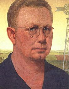
One of his first paintings in this new style was American Gothic. Showing a farmer modeled after Wood’s dentist and a woman who is either his wife or daughter modeled after Wood’s sister standing stoically in front of a white farmhouse. The woman is dressed in a dark print apron mimicking 19th century Americana with a cameo brooch and a tightly knotted tie. The couple are in the traditional roles of men and women, the man's pitchfork symbolizing hard labor. Wood's inspiration came from Eldon, southern Iowa, where a cottage designed in the Gothic Revival style with an upper window in the shape of a medieval pointed arch provided the background and also the painting's title. Wood decided to paint the house along with the kind of people I fancied should live in that house. According to Wood the work is in fact intended as an affirmation of its distinctly Midwestern subject matter and implied values, standing apart from those of large American cities and, even more so, European culture. It is one of the few images to reach the status of widely recognized cultural icon, comparable to Leonardo da Vinci's Mona Lisa and Edvard Munch's The Scream.
Wood spent the rest of his life working on his own art as well as teaching others. Wood was an active painter
from an extremely young age until his death. He died of cancer on February 12, 1942, at age 50, and was buried at Riverside Cemetery, Iowa. The day before his 51st birthday, Wood died at the university hospital of cancer. When Wood died, his estate went to his sister, Nan Wood Graham, the woman portrayed in American Gothic. When she died in 1990, her estate, along with Wood's personal effects and various works of art, became the property of the Figge Art Museum in Davenport, Iowa.
Grant DeVolson Wood was born on Feb. 13, 1891, in Anamosa, Iowa. This American painter was one of the principal Regionalists of the 1930s. With his paintings of small town life, Midwestern landscapes and historical scenes, Wood became the de facto spokesperson for the American Regionalist movement. Wood exemplified the Regionalist style through his paintings of small town folk and life in the Iowan countryside.
In 1891, Grant Wood was born to Hattie Weaver and Francis Maryville Wood on a farm near Anamosa, Iowa, a rural town with a population of about 2,000. His mother moved the family to Cedar Rapids, after his father died in 1901. Wood’s grammar school teacher, Emma Grattan, is credited as the first person to support the youngster’s interest in art. At the age of fourteen, Wood submitted a drawing of oak leaves to a sweepstakes and won first prize. During his high school years, he befriended artist Marvin Cone , and together, they designed sets for the school’s theater department. Woods graduated from Washington High School in 1910. On the night of his graduation, he left for a summer course taught by nationally known architect and designer Ernest Batchelder at the Minneapolis School of Design and Handicraft. After high school, he studied in the United States and Europe and developed an interest in Impressionism. Over the next few years Wood further expanded his creative repertoire by learning to work with metal and jewelry as well as build furniture. Wood was an active painter from an extremely young age until his death, and although he is best known for his paintings, he worked in a large number of media, including lithography, ink charcoal,ceramics,metal,wood, and found objects. In 1913, Wood relocated to Chicago, where he set up a jewelry and fine metalwork shop. In Chicago, Wood spent his days at his jewelry and metalworking shop and his evenings developing his talents through correspondence courses and classes at the Art Institute and even served in the U.S. Army as a camouflage designer. When his mother fell ill in 1919, he returned to the family home in Cedar Rapids and took a position as a grammar school teacher in order to support her and his younger sister. However, his familial obligations did not stop Wood from continuing to make progress as an artist. Abandoning his earlier Impressionistic leanings, Wood began to formulate a more realistic style through which to convey the rural subject matter he'd held dear since his youth. In his 1928 trip to Munich he oversaw the making of the stained glass windows he had designed for a Veterans Memorial Building in Cedar Rapids. In 1932, Wood used his newly won fame to co-found the Stone City Colony and Art School, where he could spread the message of Regionalism to aspiring artists. Two years later, however, he accepted a position with the art department at the University of Iowa, where he believed he could have an even greater impact. That same year, Wood was also named director of the Public Works of Art Project in Iowa and was featured in a Time magazine cover story about Regionalism. In 1935 he published the essay “Revolt against the City,” in which he laid out the tenets of the movement. In 1935, her suddenly married a woman named Sarah Maxson, with whom he would maintain a difficult relationship for the next few years. Wood and Maxon ultimately divorced in 1939.
One of his first paintings in this new style was American Gothic. Showing a farmer modeled after Wood’s dentist and a woman who is either his wife or daughter modeled after Wood’s sister standing stoically in front of a white farmhouse. The woman is dressed in a dark print apron mimicking 19th century Americana with a cameo brooch and a tightly knotted tie. The couple are in the traditional roles of men and women, the man's pitchfork symbolizing hard labor. Wood's inspiration came from Eldon, southern Iowa, where a cottage designed in the Gothic Revival style with an upper window in the shape of a medieval pointed arch provided the background and also the painting's title. Wood decided to paint the house along with the kind of people I fancied should live in that house. According to Wood the work is in fact intended as an affirmation of its distinctly Midwestern subject matter and implied values, standing apart from those of large American cities and, even more so, European culture. It is one of the few images to reach the status of widely recognized cultural icon, comparable to Leonardo da Vinci's Mona Lisa and Edvard Munch's The Scream.
Wood spent the rest of his life working on his own art as well as teaching others. Wood was an active painter
from an extremely young age until his death. He died of cancer on February 12, 1942, at age 50, and was buried at Riverside Cemetery, Iowa. The day before his 51st birthday, Wood died at the university hospital of cancer. When Wood died, his estate went to his sister, Nan Wood Graham, the woman portrayed in American Gothic. When she died in 1990, her estate, along with Wood's personal effects and various works of art, became the property of the Figge Art Museum in Davenport, Iowa.
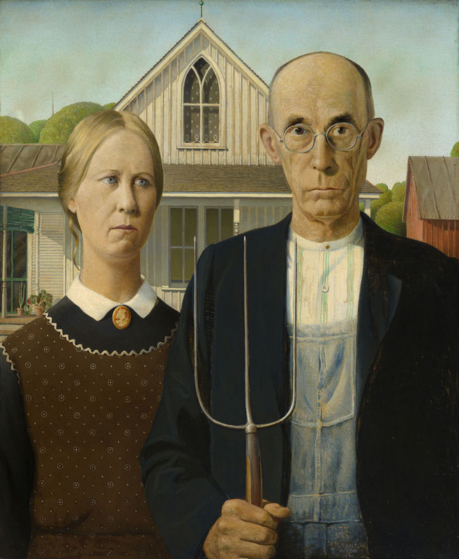
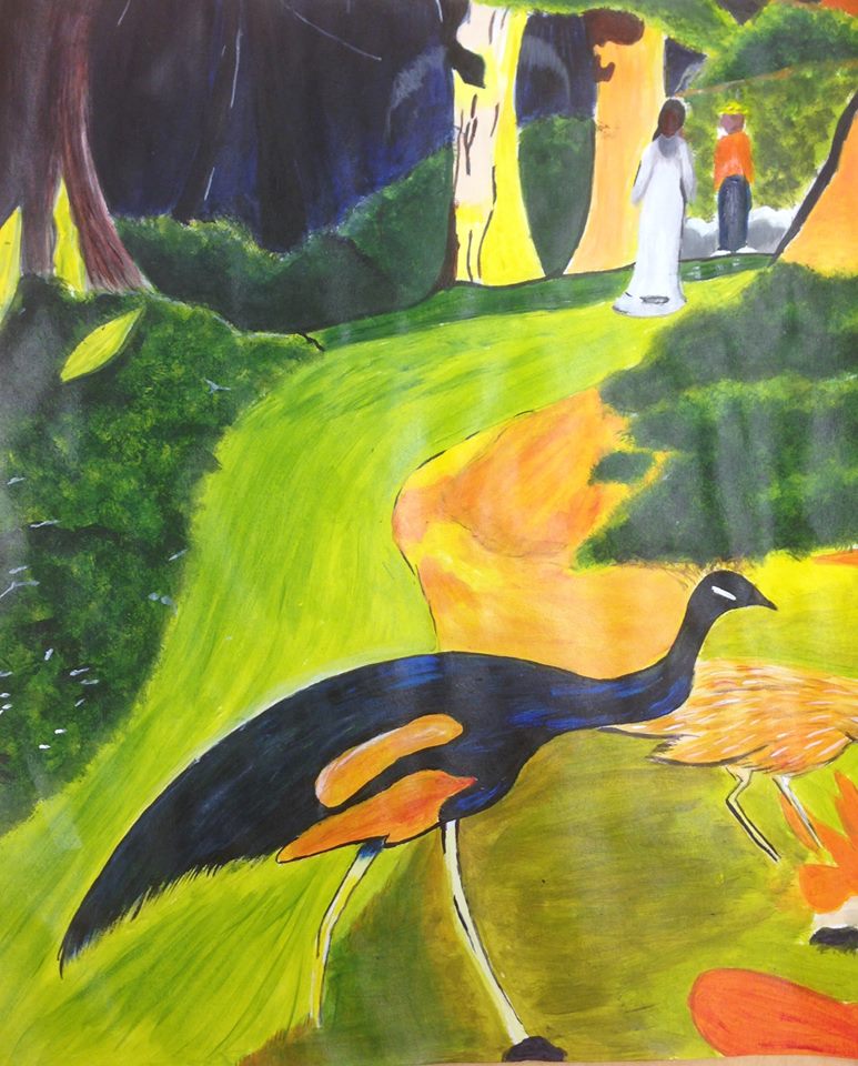
Pitchfork wielding farmer and a woman commonly presumed to be his wife is perhaps the most recognizable painting in 20th century American art.
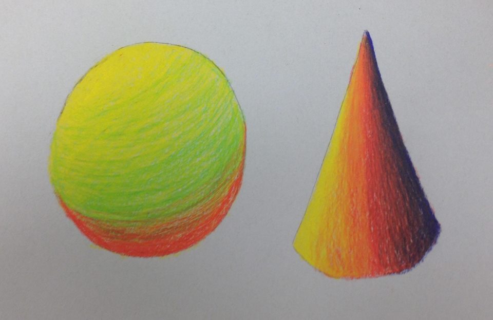
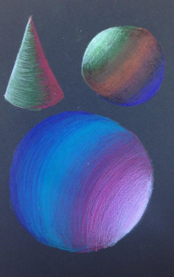
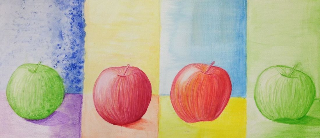
Acrylic Color Wheel
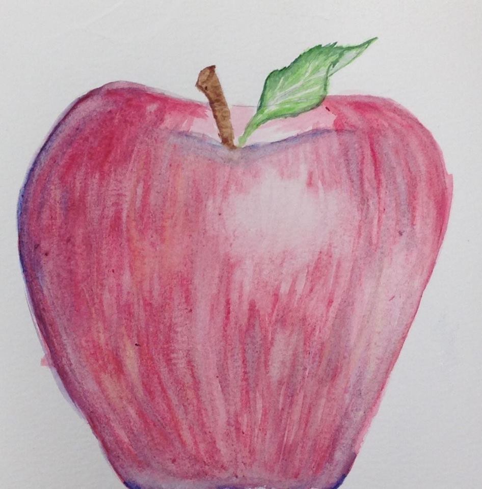
Acrylic Painting
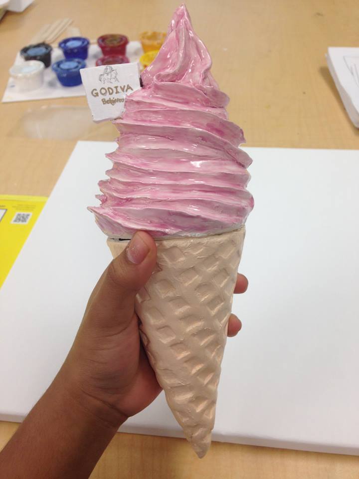
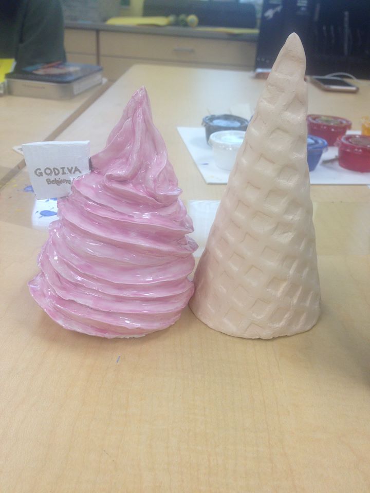
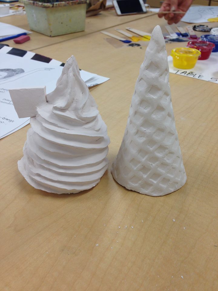
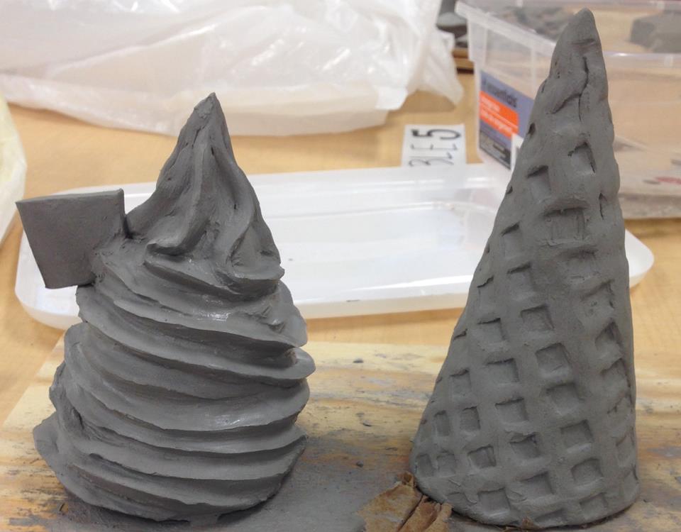
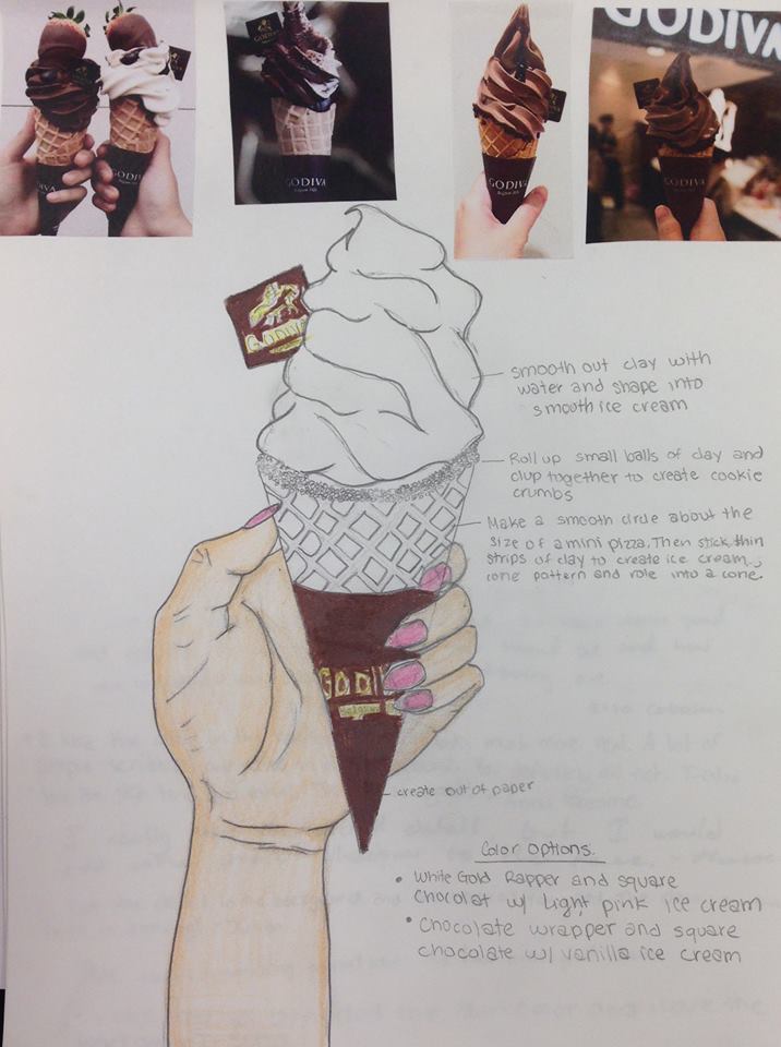
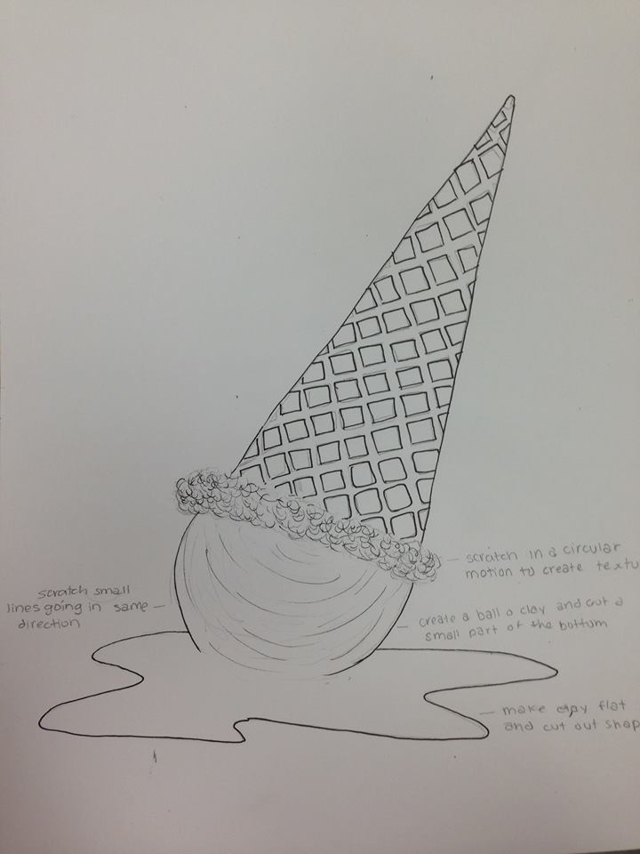
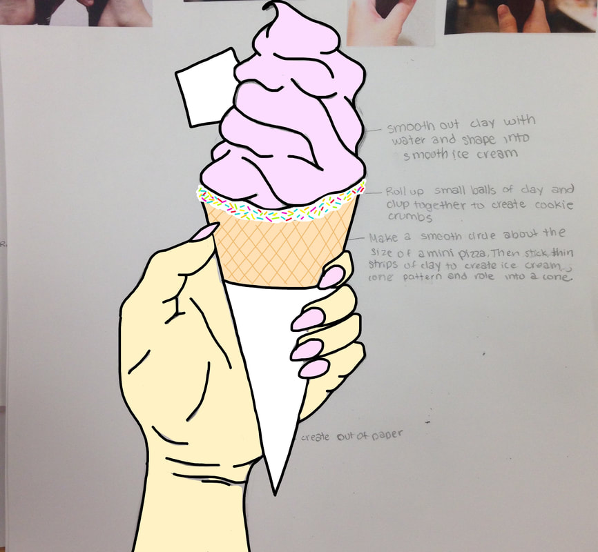
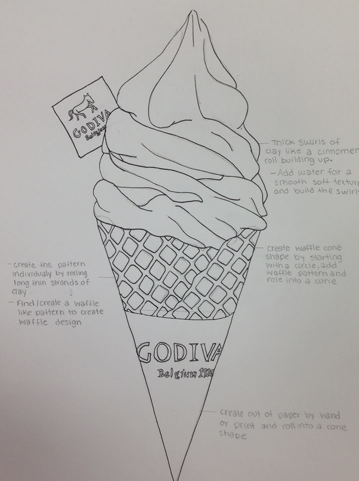
Food Sculpture
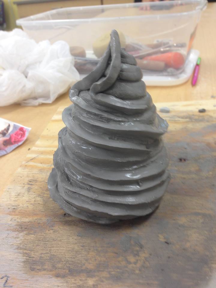
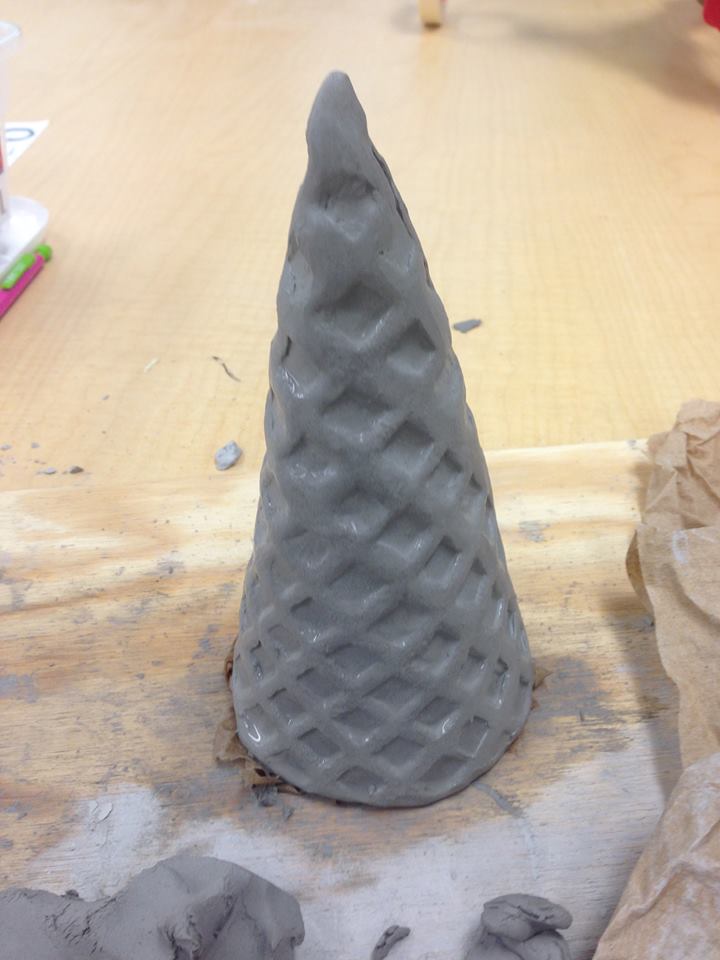
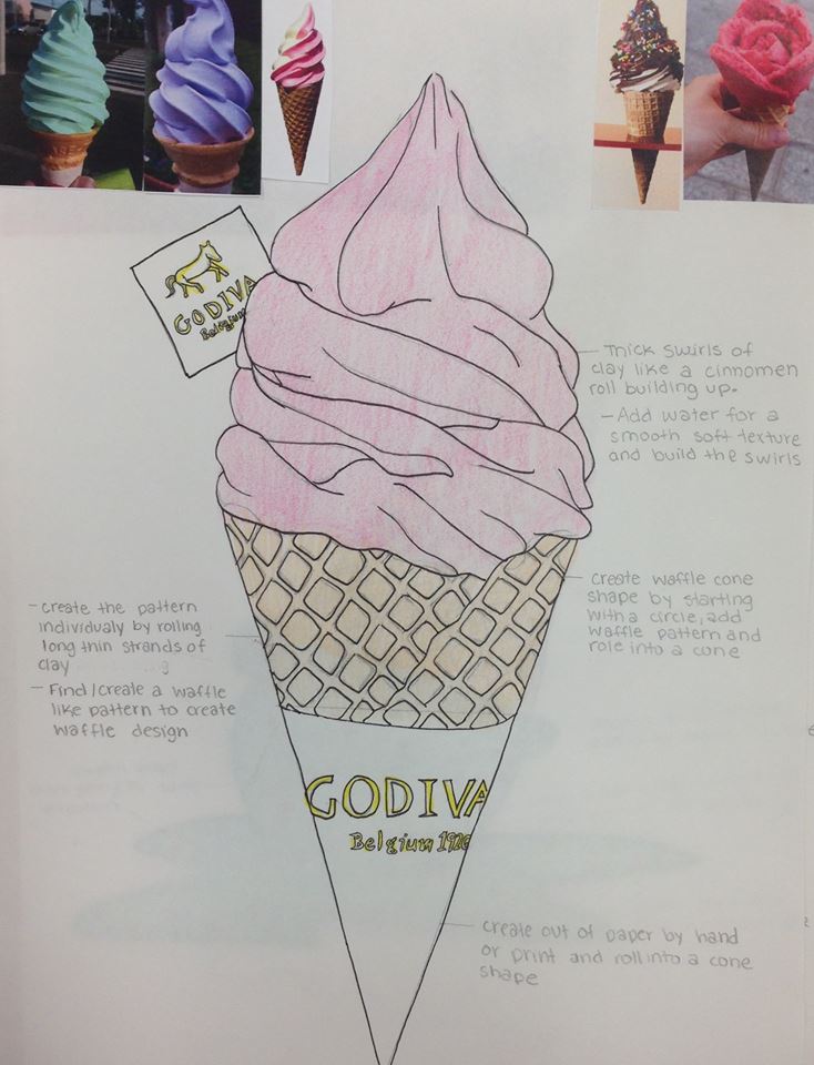
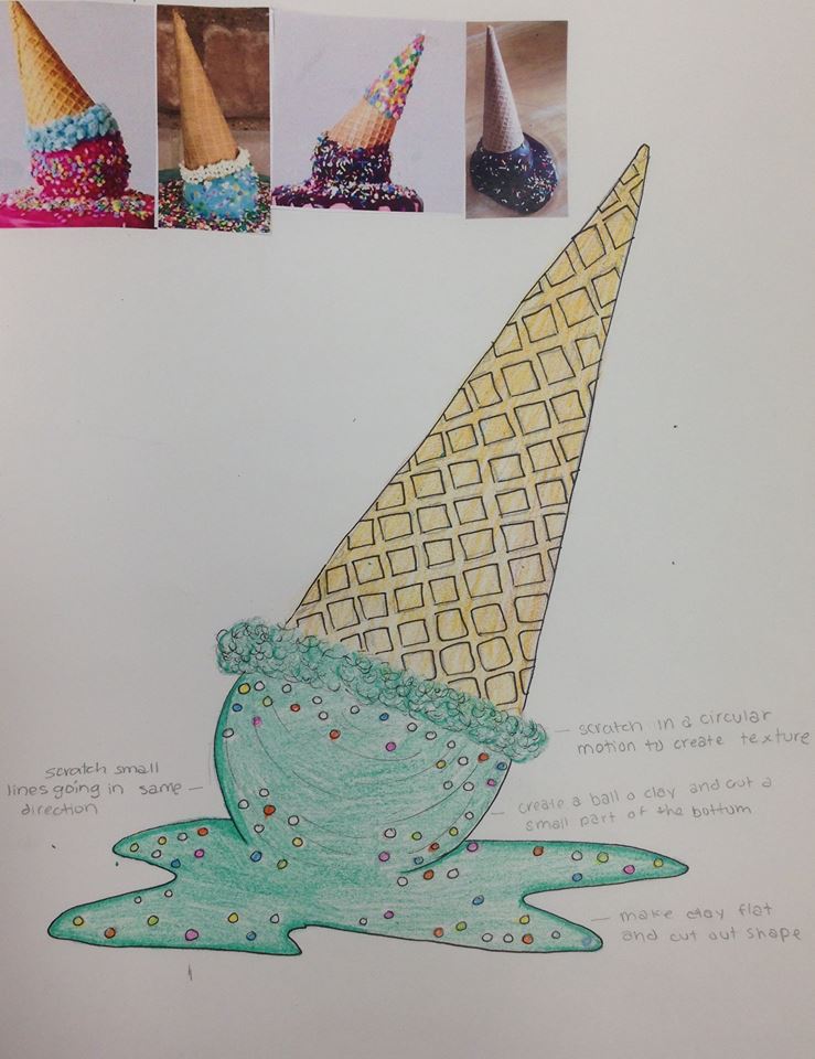
Clay Food Critique
Name:
Self Evaluation
Describe the craftsmanship of your sculpture. (Is it neat and well executed?)
I think that I sculpted the product as neat as I could but the ice cream swirls were hard to shape neatly.
What was the most difficult part of this project?
The most difficult part of this project was individually created the textured pattern on the ice cream cone.Although the ice cream swirl was very hard too.
Did your color choices work together harmoniously?
I think the color choice was good with the baby pink ice creams.Especially the matching chocolate with the rapper.
Is your sculpture interesting from all views?
Yes because the color combination is cute and nice to look at in all views.
Describe the differences in constructing a sculpture and doing something 2D.
The construction of 3D vs 2D vary because the over all products are different.Something 2D would be raised a little while something 3D is more hands on and you get I feel of the actual object.
How did you create textures in your sculpture?
I created to smooth texture on the ice cream swirl by adding more water and I carved the squares on the ice cream cone.
Does your sculpture look like the actual food? How did you accomplish this?
Yes my sculpture looks like the actual food.
What would you do differently if you were to do this project again?
If I were to do this project again I would most likely pick a food to sculpt with more texture like an orange .
Clay Terms – Define each
- Ceramics: made from clay hardened by heat.Objects produced by shaping pieces of clay that are then hardened by baking, or the skill of making such objects
- Clay:thick, heavy earth that is soft when wet, and hard when dry or baked:
- Wedging: the process of using a piece of wood, metal, or other material with a pointed edge at one end and a wide edge at the other, used to keep two things apart or, whenforced between two things, to break them apart.gets air bubbles our of your clay by pushing and compressing your clay on the table
- Pinch: the act of a small amount of something, esp. the amount that you can hold between your finger and thumb.using your fingers to pinch and poke a single lump of clay into any form
- Coil building:rolling out long snakes of clay between your hands or on the table
- Score and Slip:a technique used in which cris-cross marks are incised onto the surface of two pieces of clay before joining with slip
- Kiln:the furnace in which ceramics are fired.The furnace in which ceramics are fired. Kilns can be electric, natural gas, wood, coal, fuel oil or propane. Materials used to heat the kiln can affect the work; wood ash can build up on the surfaces of a piece and form a glaze at high temperatures. Some potters introduce chemicals into the kiln to influence the effects of the firing.
- Glaze:A coating of material applied to ceramics before firing that forms a glass-like surface. Glazes can be colored, opaque, translucent or matte. (
- Plastic stage:clay is easily manipulated and bent
- Earthen Ware: A low-fire clay. Porous and not waterproof. To be functional, It must be glazed.
Research
Andy Warhol painted popular subjects such as Elvis Presley and Marlin Monroe.His art appeared in common advertisements during the 1950-1960's even though the aspect of his art was highly criticized at the time. He was famous for his silk screening technique.He became famous by depicting mundane commercial art in his own way. His most expensive painting, and it sold for $105
million dollars in 2013.He died of cardiac arrest following a gallbladder surgery in 1987.
ROY LICHTENSTEIN born in New York to a real estate broker and a housewife, raised in a middle-class family and attended a public primary school followed by a private secondary school.During WWII he was forced into the military and after he got a degree in art at Ohio State University.He had an expressionist style and producing abstract art.Although he received negative feedback on his style of work he was confident in his art.In 1963, he produced one of his most famous works Drowning Girl.
Claes Oldenburg is a Swedish-American architect and artist.He is best known for his floppy sculptures and larger than life work of everyday objects.
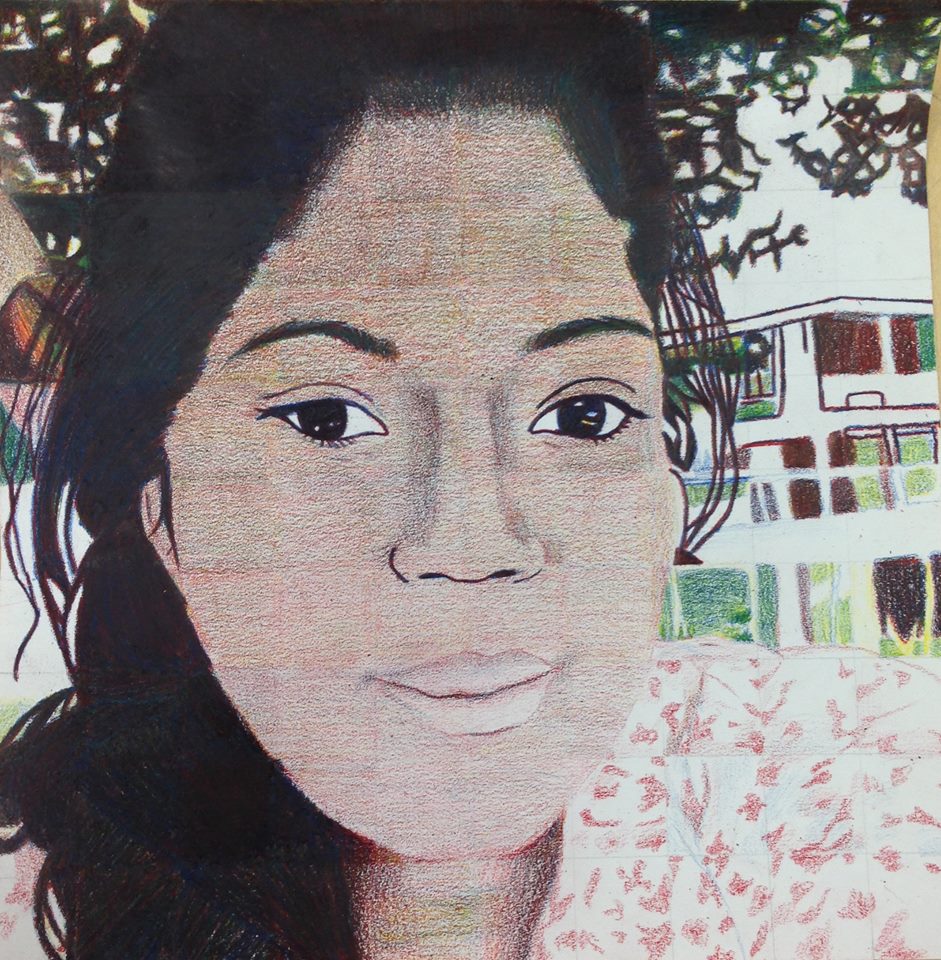
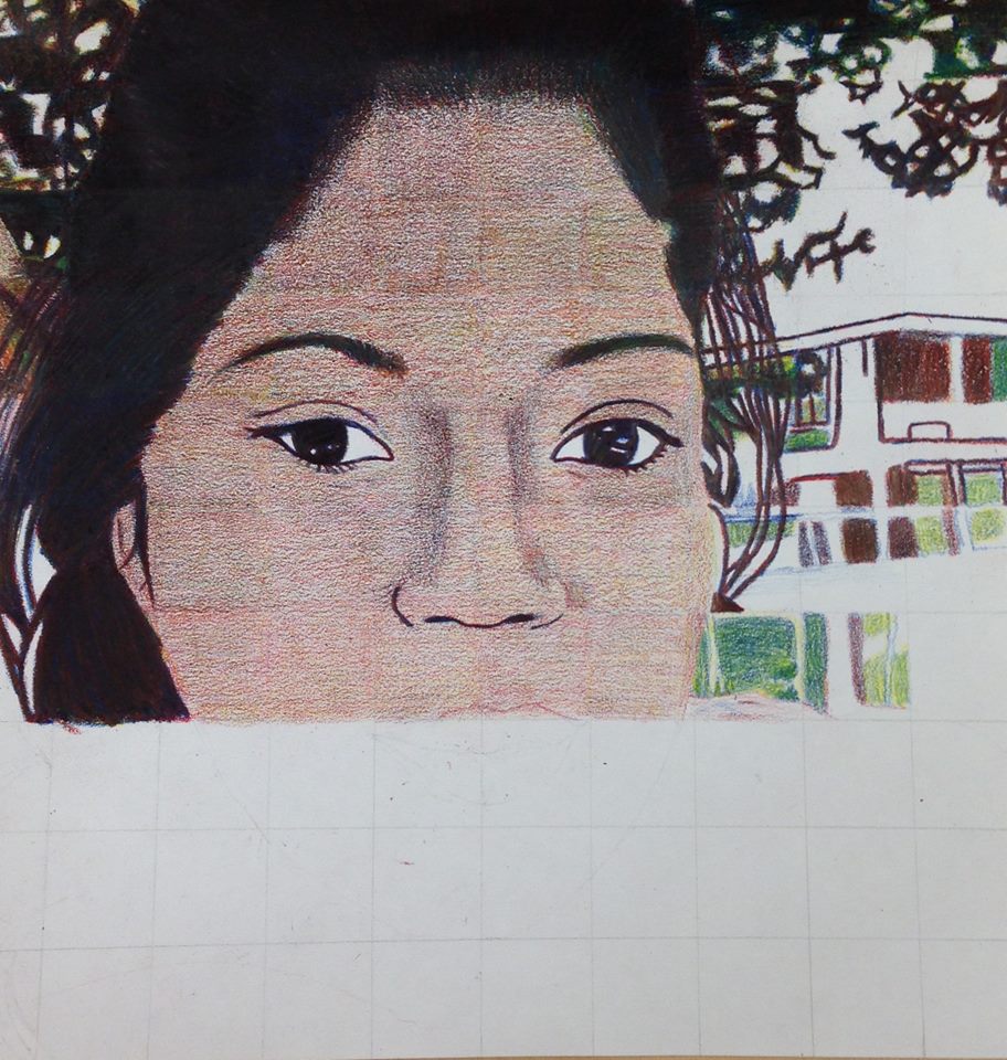
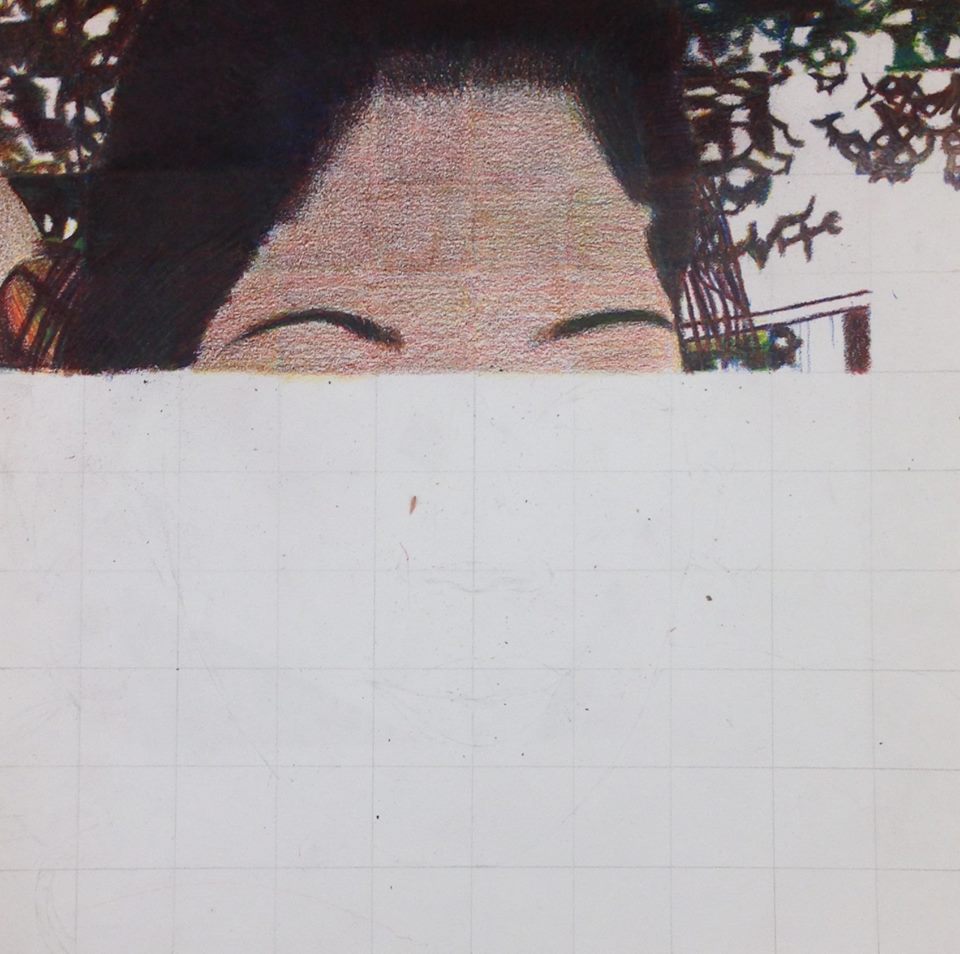
Primary Color Self-Portrait Critique
Self Evaluation
Describe the craftsmanship of your portrait. (Is it neat and well executed?)
My portrait is somewhat neat because on some parts I went a little over the line.And the red and blue although layered they are still visible.The portrait is neat enough that the end result is almost the the original photographic portrait.
Describe any difficulties you had blending and mixing your colors.
I found it difficult staying in the lines when coloring.Its not like I was working in coloring a kids coloring book although in order to layer the lines had to all be the same over and over again.The layering was very extensive in order to receive the desired colors.
Did you follow directions and draw each grid box separately? Why is this important?
At first I did not color in each grid box separately.It is important because it part of the concept and main point of using 3 colors and doing things a particular way.
How did you create value changes with your colored pencils?
I created value changes with colored pencils by using different amount of pressure to create and light and dark effect.The more pressure I as to the colored pencil and darker the color and vise versa.
Discuss how you were able to get the color you wanted from the 3 pencils?
The 3 primary colored when combined in a particular order create other colors.For example if I were to blend the blue and yellow colored pencils I would get green.And all of the colors mixed together create great shadow areas.
How could you improve your portrait?
I would have improved by portrait by follow all directions carefully and taking my time and not rush.The main point of I would be that every detail is important.
Looking back do you feel you were prepared for this project? What part of the unit was beneficial in the success of the portrait?
I had the materials to accomplish the project although I was not completely prepared when following directions.
Choose another classmate’s piece that you feel is an excellent example of mastering the techniques. Discuss why you feel this way.

Colored Pencils
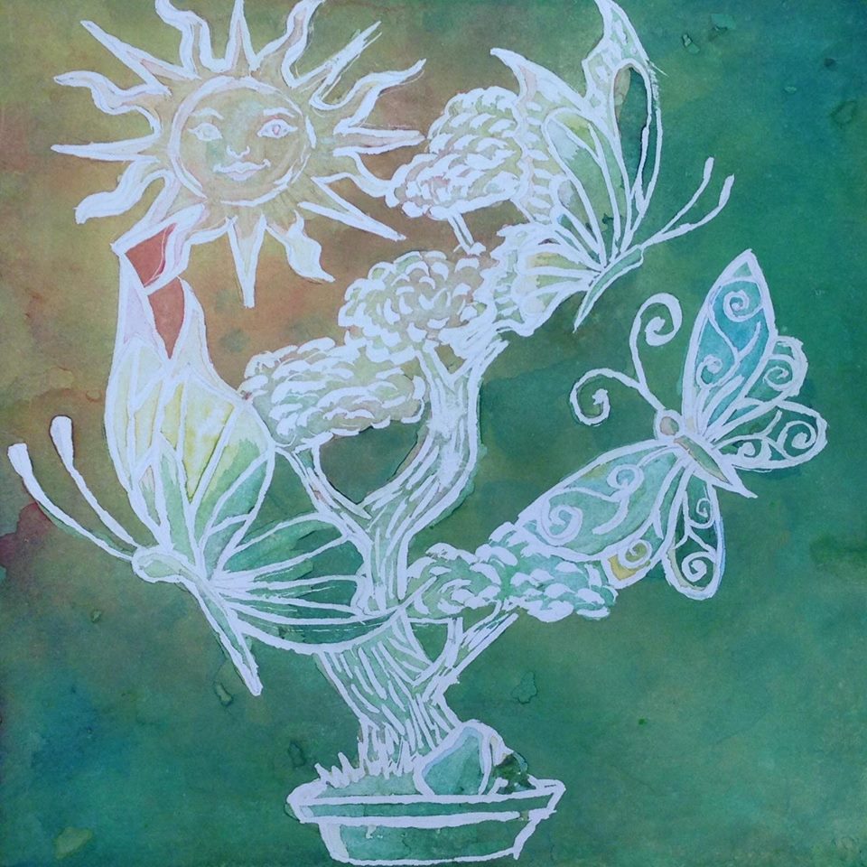
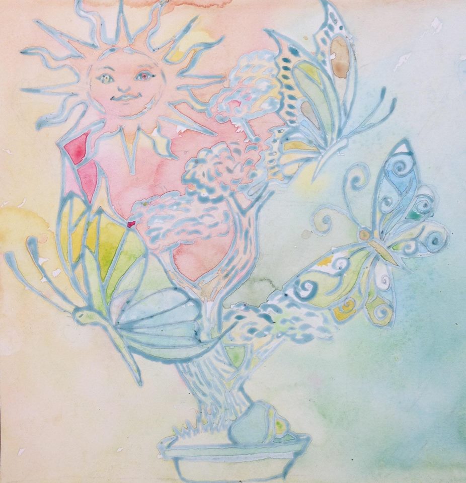
Watercolor
Art 2 Guest Artist Watercolor Critique
Self Evaluation
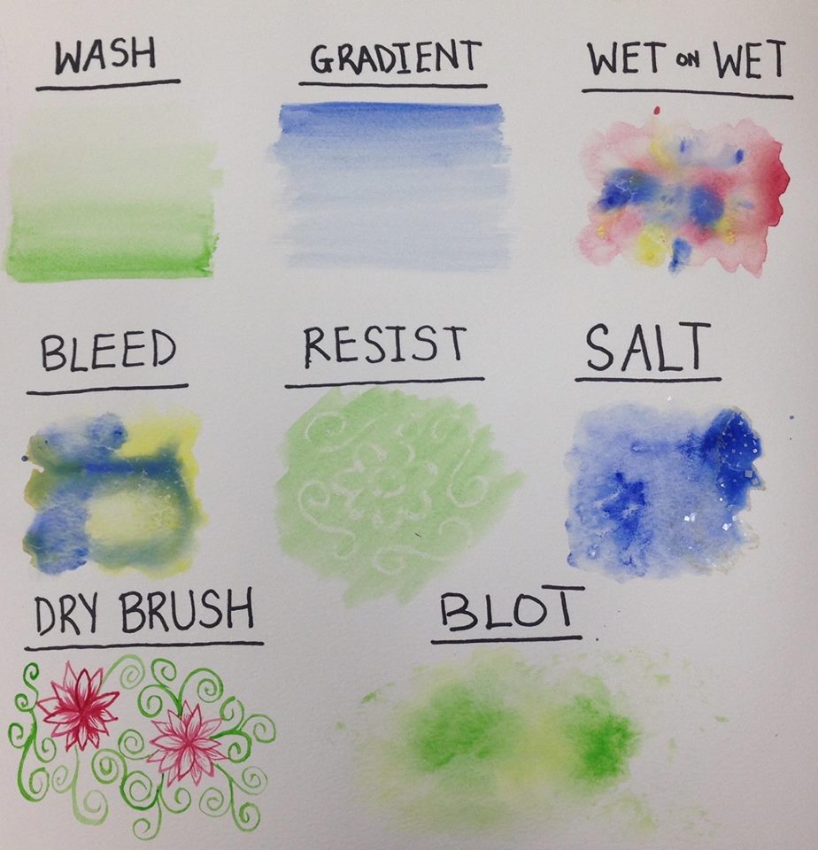
The process for creating a poured watercolor painting is to add the blue masking fluid to cover areas which to keep.Then once that dries you spray water and add random watercolors.And you move the watercolor together to mix the colors.Finally you keep repeating that process and layer the artwork.
Self Evaluation
- Explain the process you had to use to create the poured watercolor painting.
The process for creating a poured watercolor painting is to add the blue masking fluid to cover areas which to keep.Then once that dries you spray water and add random watercolors.And you move the watercolor together to mix the colors.Finally you keep repeating that process and layer the artwork.
- Describe any difficulties you had with this process.
- What were 4 things you learned from this project?
- What would you do differently if you were to do this project again?
- How did you use layers, textures, and color to create a successful piece?
- Do you feel that the mini watercolor lessons were beneficial to you learning more about watercolor? Explain.
- Was having a guest artist a positive experience? Explain.
- What did you learn from the guest artist that gave you more insight into being a professional artist?

Pen and Ink / Patterning SELF EVALUATION
Describe how you arranged your composition. Discuss your use of the elements and principles. Is it a successful composition?
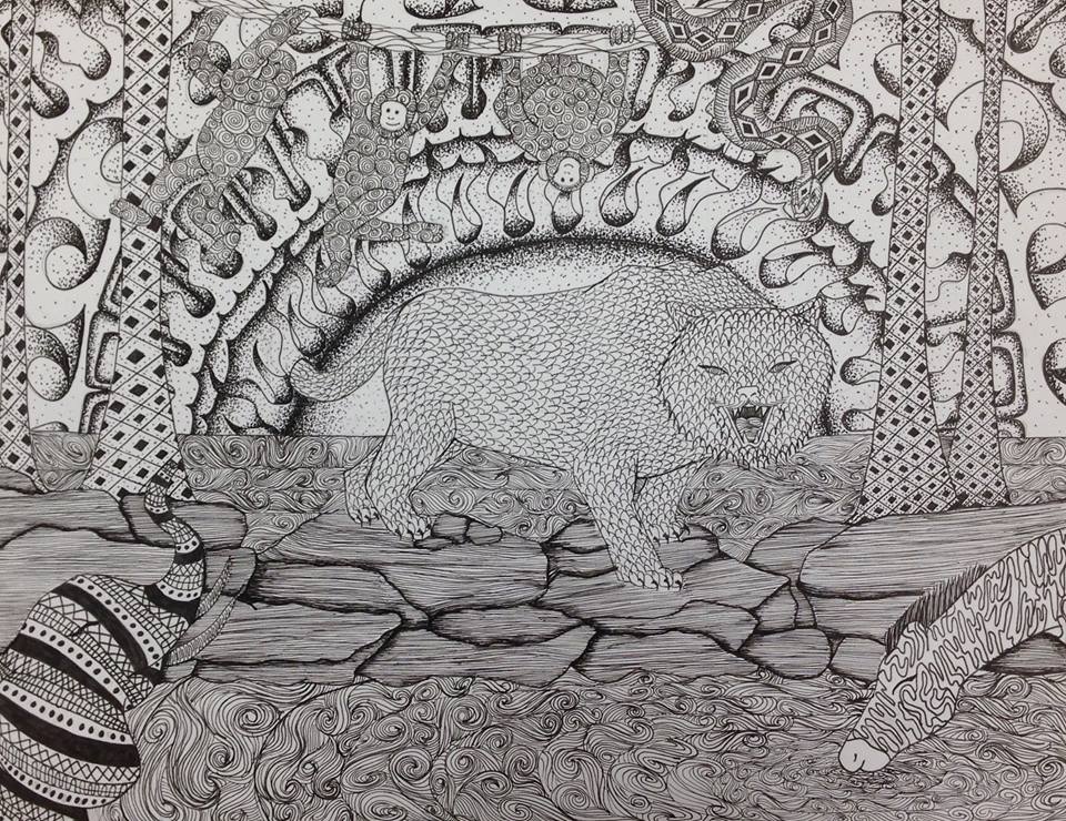
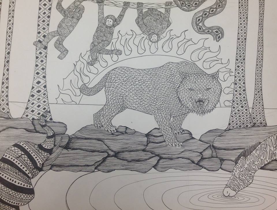
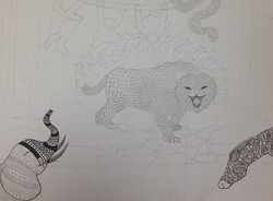
The subjects of my copositon feel as if they belong together and not out of place.My work is of wild animals in the jungle.The most used patterns include swirls and curves.The viewer eyes mostly want to rest on the most important thing or focal point in the work which is the tiger, otherwise the eye feels lost, wandering around in the space.Then the monkey in the back are smaller because they are farther way while the tiger is more upfront which is close.The sun which is more important the element is bigger and bolder than a less important element which might be smaller and fainter.
How is texture and pattern are important in your composition?I really like the pattern I choose on the tiger because it reminds of how fur moves and that added the texture of realistic fur.
Why is value so important in this project? The value determines whether something is bold or faint.In my artwork the elephant, monkeys, and water are bold.
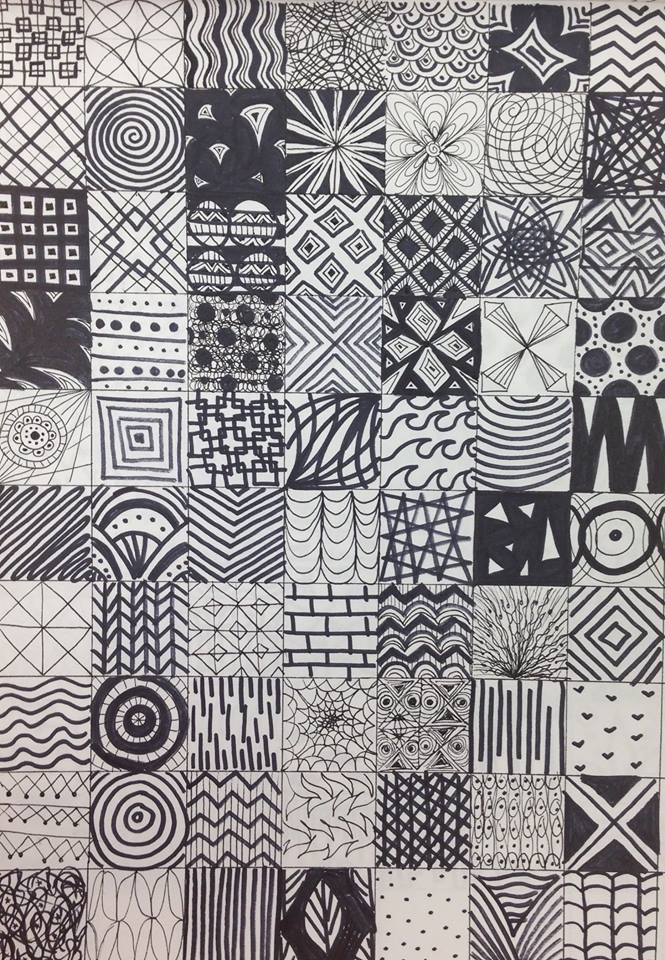
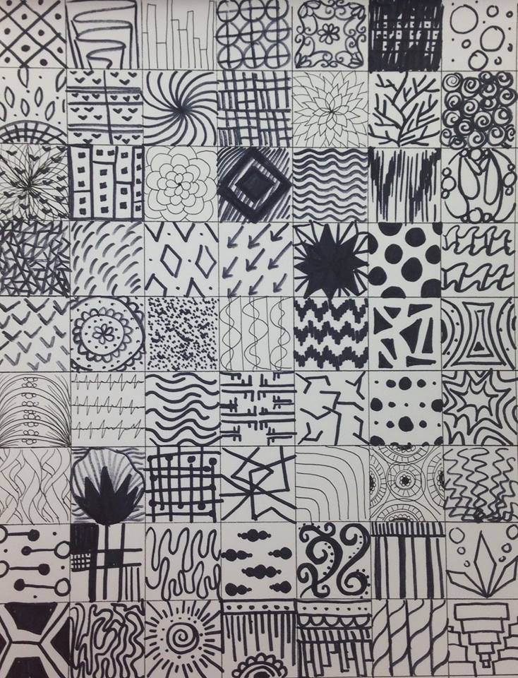
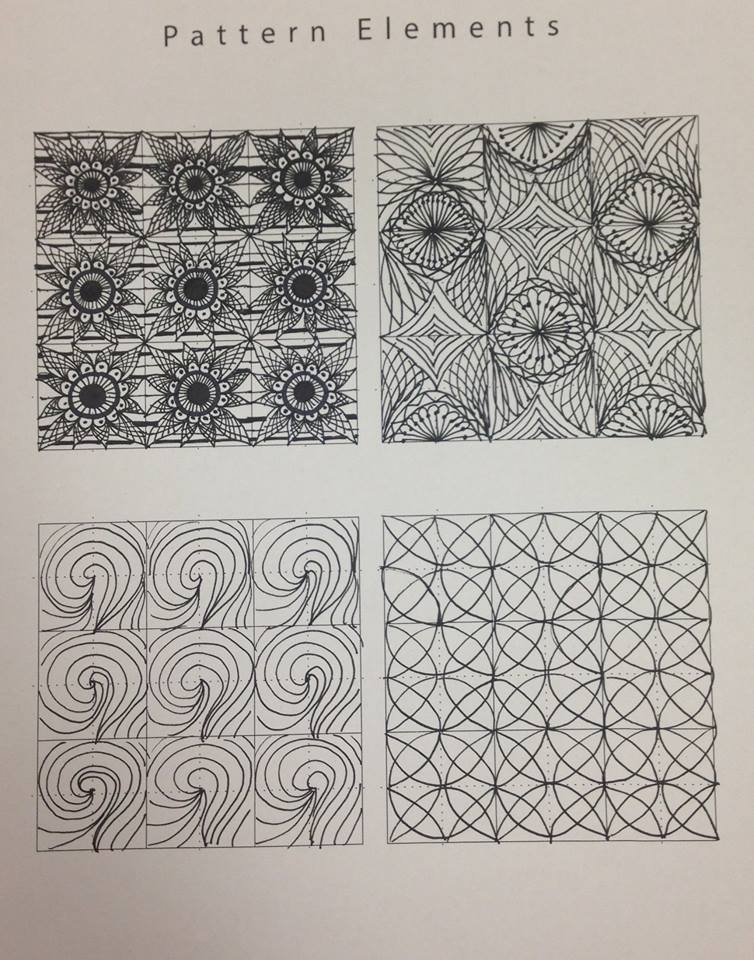
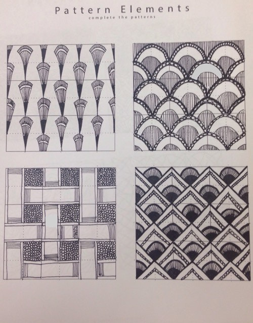
Describe your craftsmanship (How well the project is crafted technically). The project crafted through pattern practice, organizing placement ideas, and final project rough draft .The pattern practice was extensive in which I created 100 pattern designs.And I researched some ideas of what the project would be about in which I came up with ideas that included the sea, jungle, and roaster.In the end I choose the jungle since is a place that looks like it has a lot going on.
Explain how your knowledge and creating practice studies with value and pattern contributed to the success of your piece.My knowledge of darker parts represent as bold and create a contrast with everything else around .
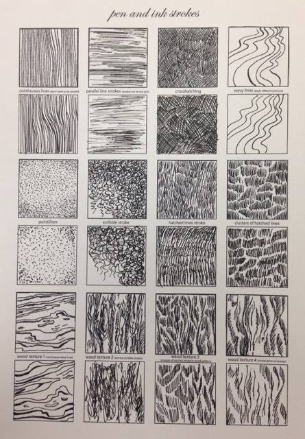
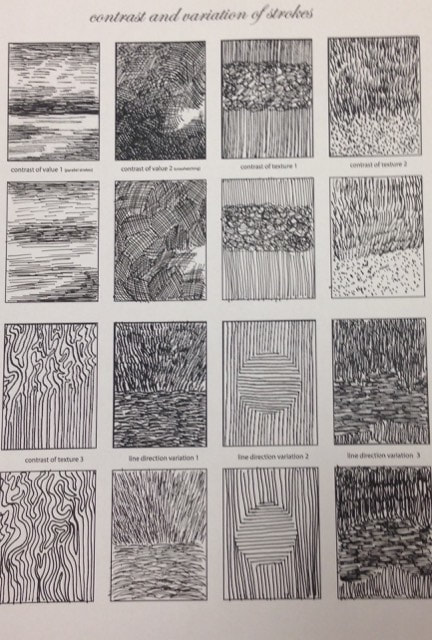
When applying the pen and ink/pattern techniques why and how is it important to make sure you understand the concepts taught in class?
When applying pen and ink pattern techniques it is important for one to understand that different types of methods to apply shadow and depth to contrast other objects in the artwork.
As a growing artist how do you think what you have learned will guide and better your future projects. Explain.
As a growing artist what I have learned may guide me to use this practice more often in my future projects.If I were to more often use this practice I may end up coming a better artist with more detailed and precise artwork than the first time I started.
If you could recreate your piece what would you do differently to enhance your final outcome?
If I could recreate my piece I would have done I more zoomed in image such as in my current project on the monkey, elephant, tiger, or zebra.I believe that in a more up close view there can be more detailed added to create a realistic appeal in pattern.While a image from farther away is harder to add many patterns since everything is more far away.
Describe how you arranged your composition. Discuss your use of the elements and principles. Is it a successful composition?
The subjects of my copositon feel as if they belong together and not out of place.My work is of wild animals in the jungle.The most used patterns include swirls and curves.The viewer eyes mostly want to rest on the most important thing or focal point in the work which is the tiger, otherwise the eye feels lost, wandering around in the space.Then the monkey in the back are smaller because they are farther way while the tiger is more upfront which is close.The sun which is more important the element is bigger and bolder than a less important element which might be smaller and fainter.
How is texture and pattern are important in your composition?I really like the pattern I choose on the tiger because it reminds of how fur moves and that added the texture of realistic fur.
Why is value so important in this project? The value determines whether something is bold or faint.In my artwork the elephant, monkeys, and water are bold.
Describe your craftsmanship (How well the project is crafted technically). The project crafted through pattern practice, organizing placement ideas, and final project rough draft .The pattern practice was extensive in which I created 100 pattern designs.And I researched some ideas of what the project would be about in which I came up with ideas that included the sea, jungle, and roaster.In the end I choose the jungle since is a place that looks like it has a lot going on.
Explain how your knowledge and creating practice studies with value and pattern contributed to the success of your piece.My knowledge of darker parts represent as bold and create a contrast with everything else around .
When applying the pen and ink/pattern techniques why and how is it important to make sure you understand the concepts taught in class?
When applying pen and ink pattern techniques it is important for one to understand that different types of methods to apply shadow and depth to contrast other objects in the artwork.
As a growing artist how do you think what you have learned will guide and better your future projects. Explain.
As a growing artist what I have learned may guide me to use this practice more often in my future projects.If I were to more often use this practice I may end up coming a better artist with more detailed and precise artwork than the first time I started.
If you could recreate your piece what would you do differently to enhance your final outcome?
If I could recreate my piece I would have done I more zoomed in image such as in my current project on the monkey, elephant, tiger, or zebra.I believe that in a more up close view there can be more detailed added to create a realistic appeal in pattern.While a image from farther away is harder to add many patterns since everything is more far away.
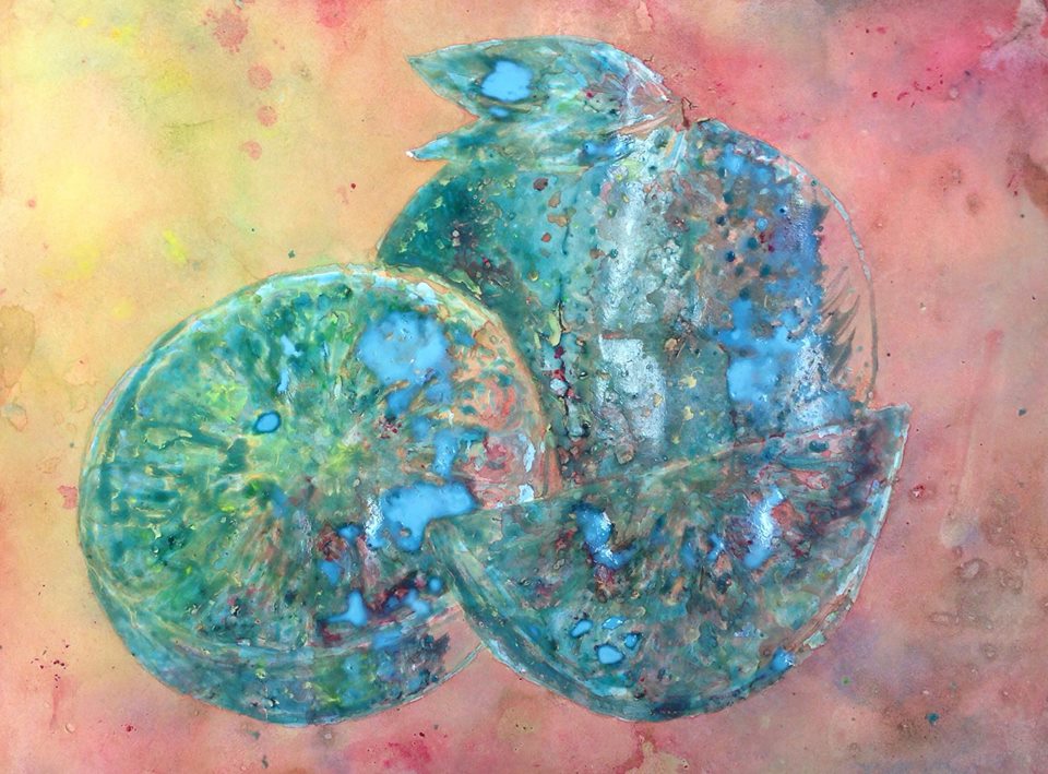
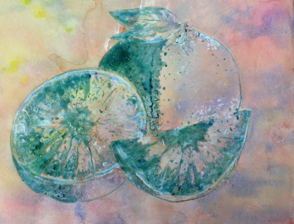
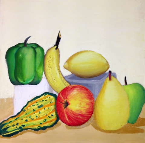
PaintingWatercolor 4 Fruit/ Veggies
Watercolor Fruit/Veggie DP Post
Watercolor Practice DP PostWatercolor Practice DP Post
Pen
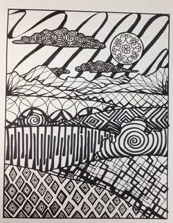
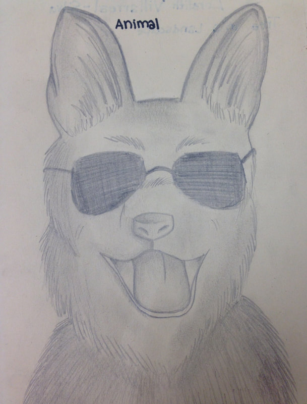
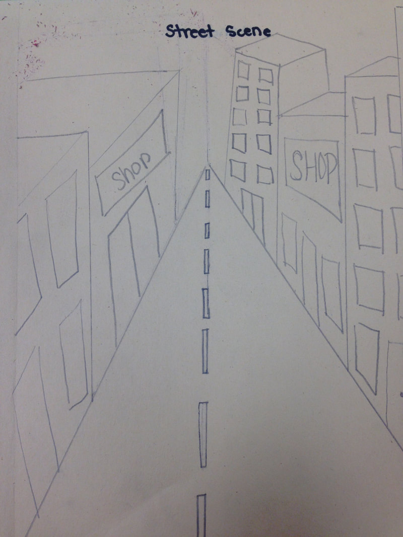
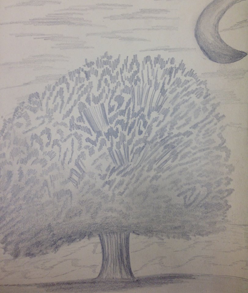
Landscapes Patterns
|
In the landscape I decided to go with mostly swirly patterns and circles. The sky looks like ribbons and the clouds have a circular patters because some clouds are puffy.I made the some lines thicker to create dept and shadow.
|
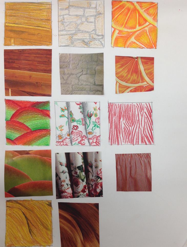
100 Squares Patterns
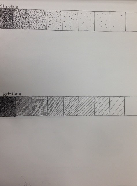
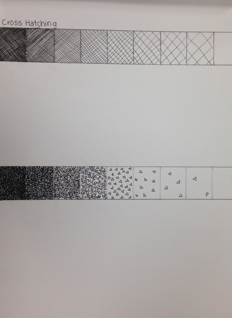
Stippling Technique
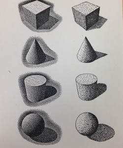
The stippling technique is the creation of a pattern simulating varying degrees of solidityor shading by using small dots. The denser the dots, the darker the apparent shade—or lighter, if the pigment is lighter than the surface.Stippling is the process of using dots and very small dashes to create a drawing.The use of different sized dots and the way they are spaced gives differing effects. For example, you can add a gray tone just by making marks that are regularly spaced in a cluster.These tiny stipple markings suggest form, shape, depth and contrast.They also convey light and shadow.You can create dark tones just by increasing the amount of dots in one area.Alternately, you create lighter tones by spreading them out.
Post 1
''Colors Paint My Mind''
Across an ocean of canvas white
A stroke of beauty comes to light
|
Life is like a blank canvas.Its up to you how you want to paint it
|
Painting is silent poetry, and painting is poetry that speaks. |

|
|
|
Photos used under Creative Commons from ANBerlin, pom.angers Essential_Photos
